June 1, 2021
Our favourite rebrands: and why

Rebrands are expensive. They’re important. And they can go wrong!
Plenty of massive brands have fallen foul of a misdirected rebrand. Throwing money at it is not a guaranteed route to an easy success story, either!
Poor Airbnb for example tried really hard to create a minimal logo. Their idea? To recall four images – of people, places, love and an A…so far, so good.
But…then they got laughed out of town, for the variety of sexual parts the audience recognised in the simple rebranded logo’s shape. And they’re certainly not the worst – GAP’s 2010 rebrand lasted just six days and cost a reported $10 million!
We’re going to use this blog to look at some of our favourite recent rebrands, and explore why they were successful.
Burger King
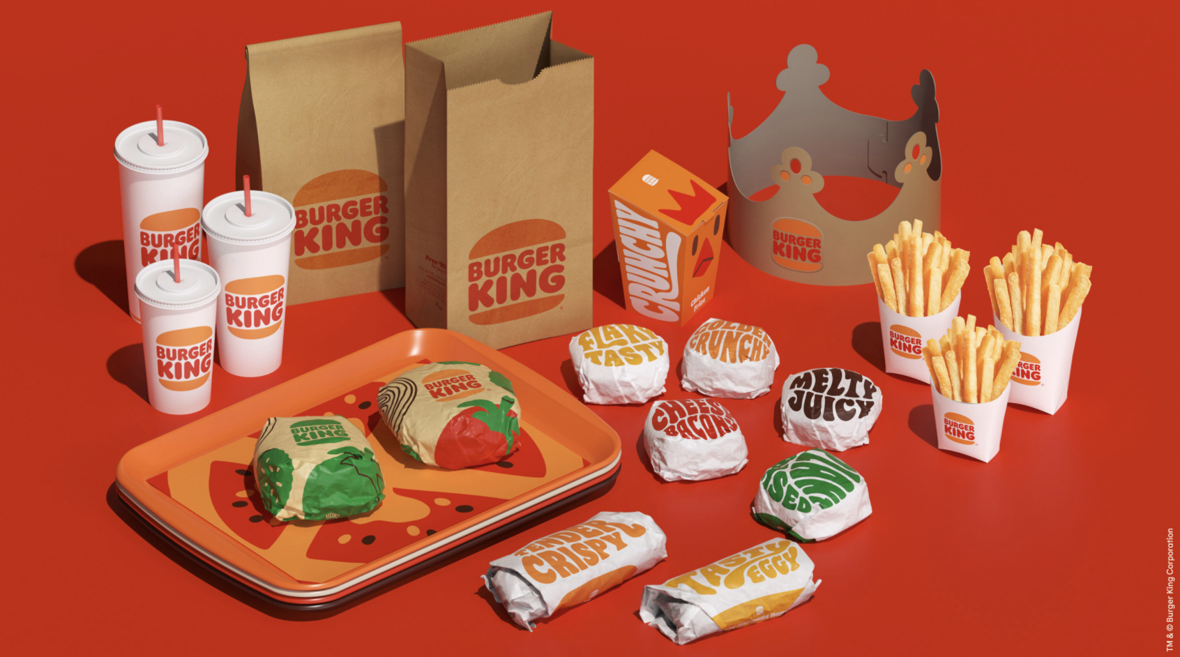
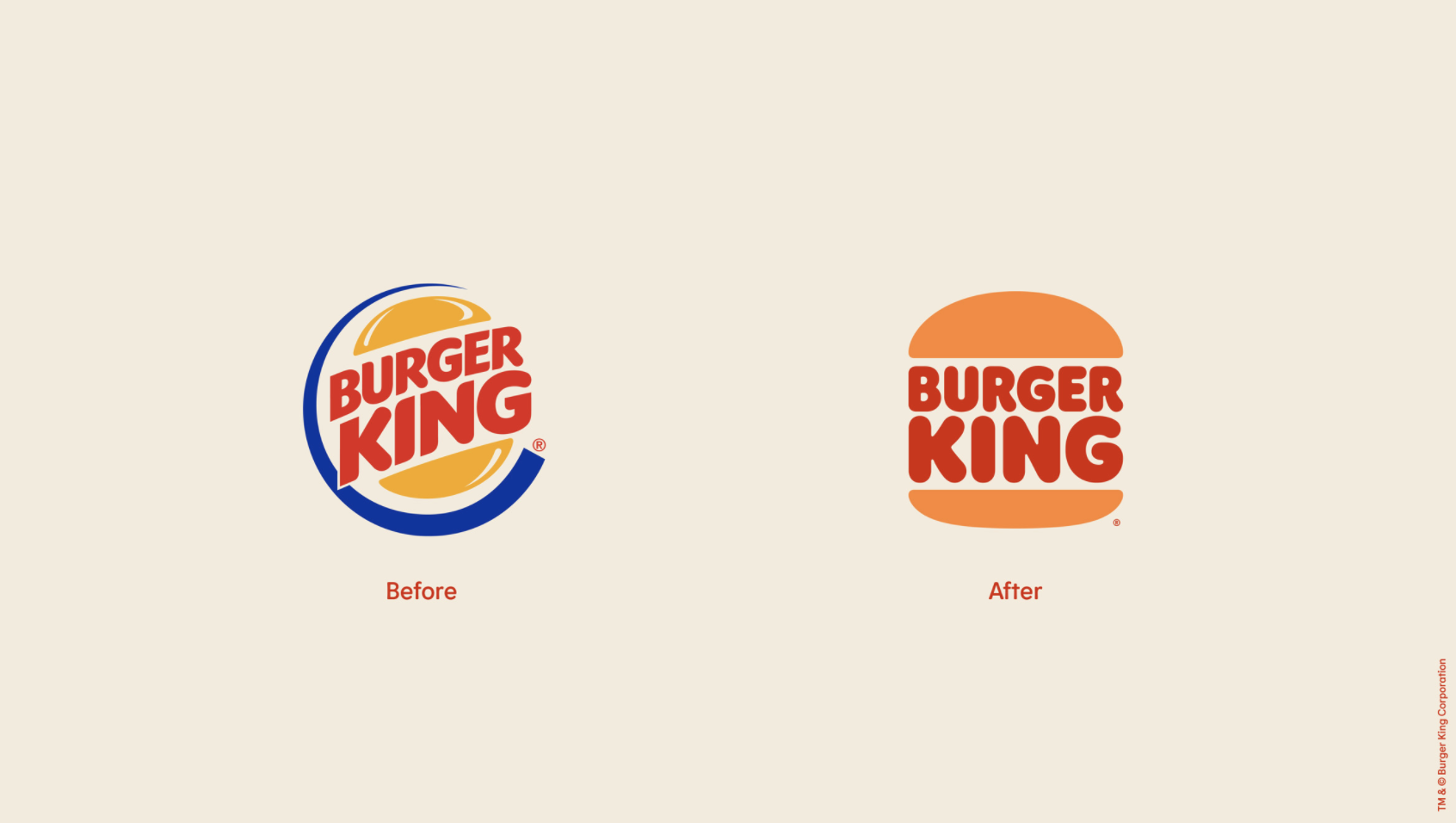
Of course, the aesthetic is not the only rebrand a company can go through. Burger King recently rebranded their aesthetic for the first time 20 years, going back to a retro 60s aesthetic:
But they’ve also been revamping their content over the past couple of years, using clever, reactive content which is – crucially – human (complete with divisive opinions and scathing humour):
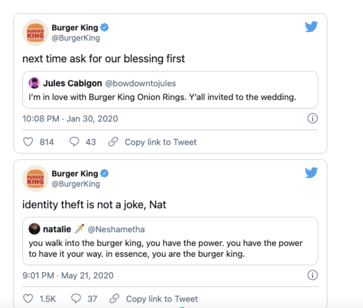
Just as we noted in our post on 2021 social trends, we’re all hunting for humanity from our brands now, and if this behemoth of a brand can deliver personality, so can the small fry.
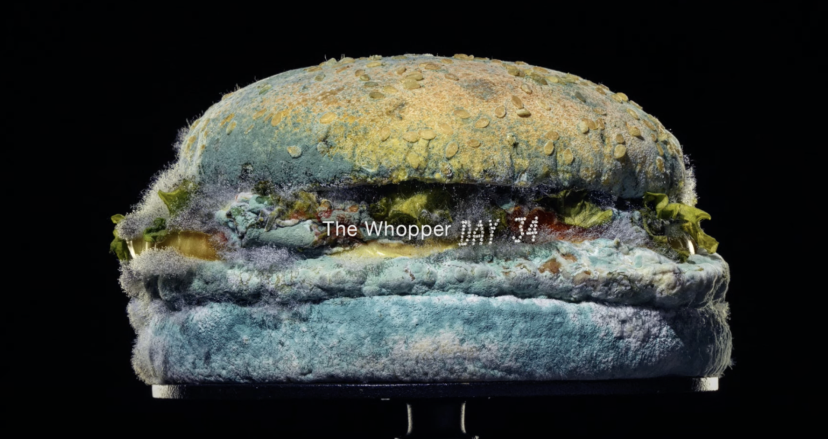
That’s not to say that Burger King’s controversial strategy can’t be polarising. The recent controversy over the ‘women belong in the kitchen’ tweet illustrated that, as to some extent did the ‘mouldy Whopper’ video. This was intended to illustrate that a Whopper isn’t stuffed with artificial preservatives, but watching a decomposing burger did turn a few stomachs!
Morrisons
When we think about rebrands, we often think about the logo and visuals, but copy rebrands count as a brand overhaul too.
Morrisons recently upped their copy game, taking it down an accessible and informal route. They looked at their clientele base, and wrote using their language. That’s accessible, Northern language with a little dialect usage thrown in too.It sounds pretty much like a no-brainer to follow that, doesn’t it? But lots of big companies fail to check-in with how their market speaks. Becoming personal with your customer is one sure-fire way to increase customer loyalty. This study shows that highly engaged customers make 90% more frequent purchases, so creating foundations for a relationship with your consumer has never been more important.
Brown & Blond
On a smaller scale, Leeds locals Brown & Blond brownies recently overhauled their look. They moved from a more traditional, classic, embellished font to a modern and streamlined look. They have changed from their “brown and blond” company name used as the logo to a focused B&B, in bold, simple font.
Adobe
Adobe recently tried to update some of their brand identities, with many a designer expressing their chagrin at the decision to use the same font, and design, across several apps, making them tougher to immediately distinguish. The icons are grouped by colour, so video apps like After Effects and Premiere Pro are a dark blue and purple combo, whilst photo apps like Photoshop and Lightroom are a darker navy with paler blue. The palettes are close, and the choice of two letter titles for each app only makes them more similar:
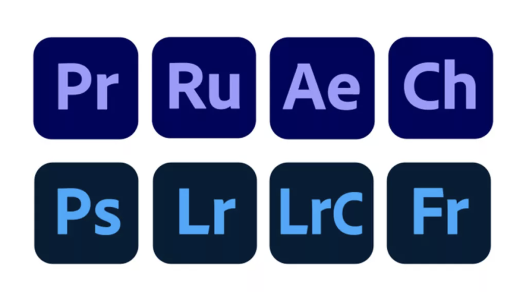
Adobe announced that its aim was to make the Creative Cloud more visually consistent, and to clarify which apps belong to the same software family (since there are more than 50 apps to differentiate between).
But since we’re not purchasing the periodic table (and because, let’s face it, many Adobe users will be using more than one Adobe programme), we think Adobe might’ve benefitted from a slight variation in visuals here. Users also commented that the logos within the icons aren’t even consistent in terms of size and alignment, which is NOT what you might expect from the creators of possibly the world’s most popular creative and design software.
Pfizer
The brand you probably didn’t know pre-pandemic but is now in common parlance! Pfizer had a logo redesign last year, the first in seventy years.
In its more than 171 year history, Pfizer has been known for disease treatment. It did away with its pill-shaped logo this year in favour of a more ‘scientific’ visual, mimicking the DNA double helix.
Pfizer branded it as a shift from commerce to science – and showed that they weren’t simply about treating diseases (the pill), but curing and preventing them. Intelligently, the Noto Sans font works across more than 800 languages, integral to their current worldwide focus. It’s simple, it’s clinical – it’s not too interesting, but it does exactly what it needs to.
Any recent rebrands we’ve missed that got you all tingly with excitement or het up with aggression? Let us know!
